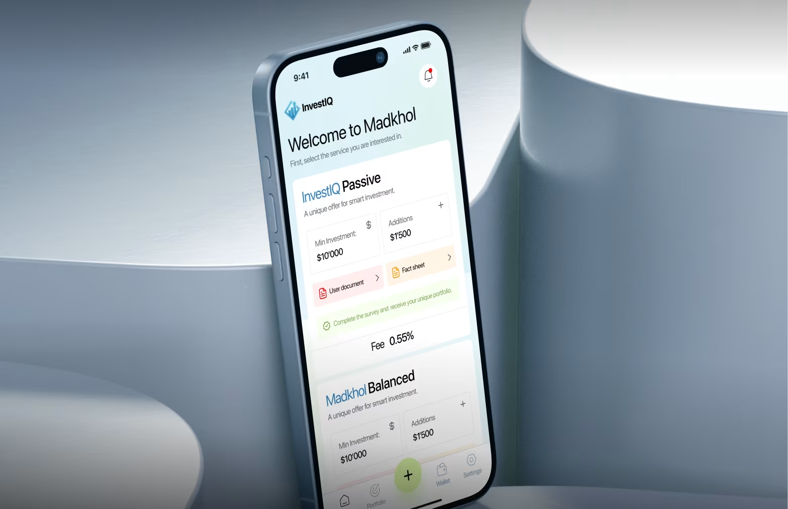
Invest IQ
Transforming portfolio management with modular dashboards, smart categorization, and narrative-driven financial visualization.
About the Project
InvestIQ is an investment tracking and portfolio management platform designed for both experienced and novice investors. The challenge was presenting vast quantities of financial data without overwhelming users. We designed a comprehensive web dashboard, mobile app interface, and visual data system that increased user engagement 71% and average session duration to 23 minutes, up from 8 minutes with competitor platforms. The project included sophisticated data visualization, customizable dashboard architecture, and a complete SaaS design system.
The Problem
Investment platforms suffered from poor information architecture and usability, causing confusion and low data comprehension. Many users opened apps but couldn't make sense of the information.
- Too many metrics displayed simultaneously with no clear hierarchy
- Poor categorization made portfolio composition hard to understand
- Complex visualizations confused rather than clarified
- Data lacked contextualization, requiring external research
- Customization options were hidden or non-intuitive
- 64% of retail investors relied on gut feeling instead of platform data
Challenges
The core challenge was managing information density without sacrificing depth. We needed to serve sophisticated investors who required detailed metrics and novice investors who needed clear narratives, while enabling configurable, modular dashboards.
- Balance detailed metrics for advanced users with simple, narrative-driven views for novices
- Design modular dashboard systems that users can configure to match their investment philosophy
- Make complex financial relationships comprehensible — asset allocation, sector diversification, historical performance
- Show interconnections between metrics without requiring advanced financial knowledge
Our Approach
We adopted an information-first methodology grounded in extensive user research across investor segments — active day traders, passive long-term investors, robo-advisors, and financial advisors. The design emphasized modular dashboards, smart categorization, progressive disclosure, and narrative-driven visualizations tested and refined with investor feedback.

Research
User research and comprehension testing with 100+ investors across segments.
Modularity
Dashboard cards organized by concept with customizable arrangements — users configure their view to match their investment philosophy.
Progressive Disclosure
Complexity revealed on demand so novices see narratives while experts access detailed metrics without friction.
Smart Categorization
Automatic grouping by sector, geography, asset class, and risk profile for instant portfolio clarity.
Visualization Strategy
Multiple visualization approaches per data type focused on storytelling rather than raw data — donut charts for allocation, area charts for performance.
Iterative Testing
Prototype testing and iteration based on comprehension and usability feedback with 80+ investors.
Project Timeline
The project spanned 15 weeks from initial research to final delivery, divided into five key phases.
- Research & Strategy (Weeks 1–3): Investor interviews across segments, competitive dashboard analysis, financial data complexity mapping.
- Data Architecture & Wireframing (Weeks 4–6): Information hierarchy design, modular dashboard planning, metric categorization system.
- Visual Design System (Weeks 7–10): Dashboard card design, data visualization styles, chart library development, color system for performance states.
- High-Fidelity Implementation (Weeks 11–13): Complete dashboard design, mobile app optimization, interactive prototypes.
- Testing & Optimization (Weeks 14–15): Usability testing with 80+ investors, comprehension testing on visualizations, performance optimization for real-time data.
Sketch
Initial sketches explored various dashboard structures — dense grids, minimalist layouts, and finally a modular card system for flexibility. Visualization tests compared pie, treemap, and nested donut charts; donut charts offered the best clarity and hierarchy. For performance, area charts proved most intuitive. User feedback emphasized customization, leading to configurable dashboards tailored to investor preferences.

Style Guide
The visual identity reflected sophistication and trust. A neutral palette — navy, gray — established clarity, with green/red for financial signals and amber/blue for highlights. Typography paired IBM Plex Mono for numbers and Inter for UI. Charts and icons followed consistent data visualization standards. Card design used soft shadows and rounded corners for hierarchy.

Wireframe
Wireframes focused on portfolio overviews, allocations, performance trends, sector and geographic breakdowns, and risk indicators. The modular system allowed users to resize and reorder cards easily, maintaining a clear focus on portfolio value and gain/loss.

Animations
Micro-interactions made data updates smooth and intuitive — charts transitioned between timeframes, values animated fluidly, and portfolio changes morphed visually. Subtle pulses and gradient loaders added motion without distraction, reinforcing trust and engagement.

Multi Screen
38 responsive screens covered dashboards, holdings, performance analytics, risk assessment, and alerts — optimized for web, mobile, and tablet with consistent information architecture and adaptive layouts.


Visual Identity & Brand Story
InvestIQ positioned itself as the "intelligent investment partner." The brand avoided intimidating finance visuals, using clean data-driven aesthetics and confident imagery. The logo's upward-trending Q symbolized smart growth. The system focused on clarity, purpose, and meaningful color use — every pixel informed, not decorated.


Results & Outcomes
Post-launch engagement rose 71%, session time tripled, and support tickets fell 54%. 67% of users customized dashboards in the first week, and transactions increased 43%. The key learning: effective financial UX prioritizes clarity, hierarchy, and user control — not more data, but smarter data storytelling.
The takeaway: Financial platforms don't fail because they show too little — they fail because they show too much without context. Clarity isn't simplification. It's intelligent hierarchy.

"Not more data — smarter data storytelling."